
Learn how to build a high converting landing page with sharper message match, faster load speed, proof, forms, testing, and a clear CTA.
Traffic is expensive, and a weak page can waste it in minutes. This guide shows how to build a high converting landing page that matches the visitor's intent, explains the offer quickly, earns trust before asking for data, and gives your team clear events to improve after launch. By the end, you will have a page structure, copy framework, technical checklist, and testing plan you can use for paid search, social ads, email campaigns, or a product launch. At Aptivanced, we treat landing pages as small conversion systems, not isolated design files.
Table of Contents
Right-click and choose 'Update Field' to populate the table of contents.
What Is a High Converting Landing Page?
A landing page is the destination a person reaches after clicking an ad, email link, social post, search result, or campaign CTA. A high converting page is focused on one action and removes everything that does not help that action happen. It is not a mini homepage. It does not need a full navigation menu, a company history, a crowded gallery, or five different offers competing for attention.
The simplest way to define it is this: the page gives the right visitor enough confidence to take the next step. That next step might be booking a call, requesting a quote, downloading a guide, starting a trial, registering for a webinar, or buying a product. The conversion rate only makes sense when the offer, traffic source, and required commitment are clear.
Benchmarks are useful, but they are not the goal by themselves. Unbounce reports a median landing page conversion rate of 6.6% from a benchmark set of more than 41,000 landing pages, 464 million visitors, and 57 million conversions. That number gives context, not a universal target. A page asking for an email address should convert higher than a page asking for a paid consultation, and a warm email audience should behave differently from cold paid social traffic.
Source: Unbounce Conversion Benchmark Report for landing page benchmark context.
That is why how to build a high converting landing page starts with intent, not templates. The design should answer the visitor's most immediate question, then move them through proof, value, risk reduction, and a clean action. If your page looks polished but visitors still hesitate, the issue is usually not color. It is relevance, clarity, friction, or trust.
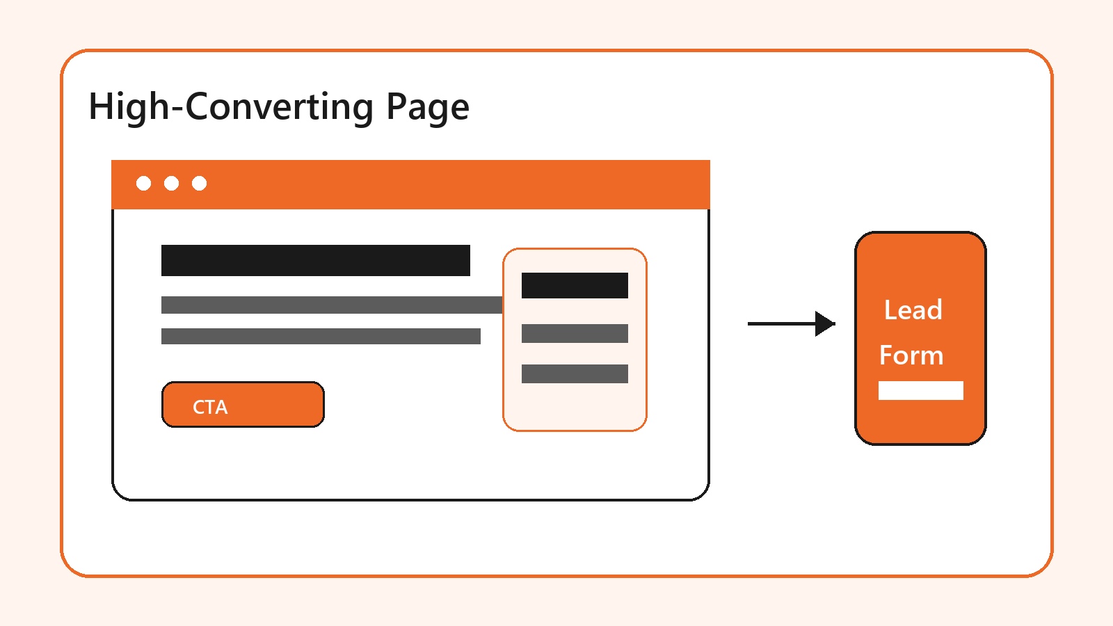
Why Conversion Architecture Matters More Than Decoration

A conversion-ready page balances message match, offer clarity, proof, and fast user experience.
Most landing page advice lists the same elements: headline, CTA, social proof, form, and mobile layout. Those elements matter, but the order matters just as much. A testimonial buried near the footer will not calm doubt in the hero. A CTA that appears before the offer is clear can feel pushy. A beautiful product visual that does not show the result may still leave the visitor guessing.
Aptivanced builds this kind of flow through landing page and sales funnel development, where the page, thank-you step, tracking, and follow-up path are planned together. That matters because the conversion does not end when someone clicks the button. A lead needs routing, confirmation, and a next message. A purchase needs reassurance. A booked call needs reminders and qualification.
The page should work like a guided conversation. First, confirm the visitor is in the right place. Second, state the outcome they can get. Third, show why the offer is believable. Fourth, remove the most likely objection. Fifth, ask for the smallest action that matches the value being offered. This sequence is calmer and more persuasive than throwing every feature above the fold.
Google also frames landing page experience around relevance, usefulness, ease of navigation, the number of links on the page, and whether the page meets expectations created by the ad. That is practical guidance for paid traffic: the page should keep the promise that earned the click.
Source: Google Ads landing page definition on landing page experience and expectations after the click.
How to Build a High Converting Landing Page Step by Step

Build the promise first, then design the layout, proof, form, and testing plan around it.
Here is the practical sequence for how to build a high converting landing page without guessing. Start with one measurable goal. Write the audience and traffic source in plain language. Draft the hero promise before opening a design tool. Add proof near the first moment of doubt. Keep the form short enough for the value being offered. Finally, launch with tracking so you know what to improve.
Define the conversion action: quote request, demo booking, checkout, trial signup, lead magnet download, or call booking.
Match the page to one traffic source or campaign angle. Paid search, retargeting, cold social, and email all arrive with different context.
Write a headline that names the outcome, not just the product category.
Place one primary CTA above the fold and repeat it after proof, benefits, FAQ, and the final section.
Use proof that reduces risk: client logos, specific testimonials, review snippets, security badges, guarantees, or before-and-after examples.
Instrument the page with analytics events for CTA clicks, form starts, form submissions, scroll depth, and thank-you page views.
This workflow prevents a common mistake: designing a page before you know what the visitor must believe. If a visitor needs to believe the service is credible, proof belongs early. If they need to understand the product, a demo visual or short process section matters. If they fear cost, pricing ranges, guarantees, or risk reversal may do more than another feature block.
For companies sending paid traffic to a page, our Google and social media ads team can align ad copy, keyword intent, creative, and the landing page so the post-click experience feels continuous.
Write the Hero Like a Buyer Is Deciding in Seconds
The hero section has one job: help the visitor decide whether the page is worth reading. It needs a specific headline, supporting sentence, visible CTA, and proof cue. The headline should echo the promise that brought the visitor there. If the ad says 'emergency roof repair quote,' the page should not open with 'trusted home improvement solutions.' That mismatch creates work.
A strong hero usually answers four questions quickly: What is this? Who is it for? What result can I expect? What do I do next? You do not need to answer every objection above the fold. You need enough clarity to keep the visitor moving. For service businesses, this often means a benefit-led headline, one concise subheadline, a primary CTA, and a short trust line such as review count, years in business, partner logos, or response time.
Good CTA text is specific. 'Get Started' is better than nothing, but 'Get My Free Quote' or 'Book a Strategy Call' tells the visitor what happens. If the action requires a form, say what they will receive afterward. If the next step is a call, say whether it is free, how long it takes, and when they can expect a response. Small expectation-setting details can lower friction.
Avoid the temptation to load the hero with everything the business does. A landing page is a single-use tool. If the campaign is about one offer, keep the hero about that offer. The rest of the page can support, prove, and clarify it.
Design the Page Flow Around Trust, Friction, and Proof
After the hero, the page should guide the visitor through the decision. A useful order is trust bar, problem clarity, solution, benefits, proof, offer details, FAQ, and final CTA. Some pages need pricing. Some need a comparison. Some need a calculator, demo, or short video. The key is to place each section where it answers a real question.
Forms deserve special care. More fields can improve lead quality, but every field should earn its place. If the offer is a simple checklist, an email field may be enough. If the offer is a custom quote, budget, timeline, service type, and contact details may be reasonable. The page should not ask for information before the visitor understands why it is needed.
This is where conversion rate optimization and web design overlap. Layout, copy, form logic, trust proof, and analytics all shape the same behavior. If a page gets traffic but few form starts, the offer may be unclear. If many people start the form but abandon it, the form may be too long, broken on mobile, or asking for sensitive data too early.
For B2B pages, use proof with substance. A vague testimonial that says 'great team' is weaker than a short quote naming the outcome, timeline, or problem solved. For ecommerce pages, use product credibility, return policy, delivery clarity, payment trust, and real customer review patterns. For local service pages, show service area, phone number, response promise, photos of work, and clear quote steps.
Benefits of a Page Built as a Conversion System

A strong landing page improves lead volume, acquisition cost, qualification, learning speed, trust, and reporting clarity.
A well-built page improves more than the visible conversion rate. It lowers wasted ad spend because fewer visitors bounce from a mismatched promise. It improves lead quality because the page can qualify the buyer before the form. It also helps the team learn faster because every major step is measurable.
The biggest advantage is operational clarity. If the page has one goal, campaign reporting becomes easier. You can see the cost per visitor, cost per form start, cost per lead, lead-to-call rate, close rate, and revenue per campaign. A generic website page usually mixes too many paths to make that diagnosis clean.
There is also a brand effect. Visitors notice when the page feels deliberate. Clear copy, fast loading, useful proof, clean forms, and a sensible thank-you path signal that the company is organized. The page does not need to be flashy. It needs to feel reliable.
If your landing page also needs custom interactive sections, integrations, or CRM handoff, Aptivanced can pair it with custom website development so the conversion path works behind the scenes as well as it looks on the front end.
Technical Setup: Speed, Mobile, Tracking, and Follow-Up
The technical side is not a bonus. A page that loads slowly, jumps while loading, or freezes when someone taps a form field can lose conversions before the copy has a chance. Google's Core Web Vitals focus on loading performance, interactivity, and visual stability through LCP, INP, and CLS. The recommended thresholds are LCP within 2.5 seconds, INP of 200 milliseconds or less, and CLS of 0.1 or less, measured at the 75th percentile across mobile and desktop.
Source: web.dev Core Web Vitals guidance for LCP, INP, CLS, and field measurement thresholds.
For landing pages, that means compressing images, avoiding heavy scripts, keeping the hero lightweight, reserving space for media, and testing forms on real mobile devices. Many teams test only the desktop design because it looks polished in a preview. The actual buyer may be on a phone, on a slower connection, and one thumb away from abandoning the form.
Tracking should be part of the build brief. At minimum, measure page views, CTA clicks, form starts, form submissions, phone clicks, calendar bookings, and thank-you page views. For paid media, connect conversions back to campaign, ad group, keyword, creative, and audience. For lead generation, track quality after submission so the page is optimized for revenue, not just raw leads.
A landing page that converts today also needs care after launch. Our website maintenance and security support can keep forms, scripts, speed, and tracking from quietly breaking after theme updates, plugin changes, or new campaign tags.
Finally, plan the follow-up. A conversion should trigger a confirmation message, a thank-you page, a notification to the right person, and a next-step sequence. For service businesses, speed-to-lead matters. For ecommerce, the thank-you path can support upsells, referral prompts, or product education. A landing page is the front door; the follow-up path is where intent becomes revenue.
Common Mistakes That Quietly Lower Conversions
The first mistake is trying to serve every audience with one page. A founder, procurement manager, returning customer, and cold ad visitor may all need different proof. If the traffic source changes, the message should usually change too. One generic page can look efficient while leaking conversions across every segment.
The second mistake is writing feature-heavy copy. Features matter, but visitors convert when they understand the outcome. Instead of listing 'advanced dashboard, automation, and integrations,' explain what the buyer can do faster, avoid, or measure. Then support the claim with proof.
The third mistake is treating design polish as proof. Smooth gradients, animations, and large screenshots do not replace evidence. Use customer quotes, numbers you can verify, case study snippets, partner logos, recognizable tools, certifications, screenshots, demos, or guarantees where they reduce doubt.
The fourth mistake is launching without a testing plan. If the page underperforms, the team debates opinions instead of reading behavior. Before launch, decide what will be tested first: headline, offer, form length, CTA copy, proof placement, hero visual, pricing visibility, or traffic segmentation. Change one meaningful thing at a time unless the page is broken enough to need a full rebuild.
Pre-Launch Checklist for a High Converting Landing Page

Before launch, confirm the goal, message match, CTA, proof, mobile layout, Core Web Vitals, and tracking path.
Use this checklist before sending paid traffic or announcing the page. It is intentionally practical. The goal is to catch problems that make a page feel confusing, slow, risky, or impossible to measure.
The page has one primary conversion goal and one primary CTA.
The headline clearly matches the campaign, keyword, or email promise.
The first screen explains the offer, audience, and next step without relying on scrolling.
Proof appears before the first high-friction ask.
Forms request only the information needed for the value being offered.
Mobile spacing, buttons, form fields, and sticky elements work on real devices.
Analytics events, conversion pixels, CRM notifications, and thank-you page redirects are tested.
This is also the right moment to check accessibility basics: readable contrast, descriptive labels, keyboard-friendly forms, alt text for meaningful images, and clear error messages. Accessibility is not separate from conversion. If a visitor cannot read, tap, submit, or understand the page, the page is leaving revenue behind.
For follow-up after the form, email marketing automation can turn a captured lead into a timed sequence of confirmation, education, reminders, and sales support.
External Links and Sources
Benchmark source: Unbounce Conversion Benchmark Report
Paid traffic source: Google Ads landing page definition
Performance source: web.dev Core Web Vitals
FAQs
What makes a landing page high converting?
A high converting page has one clear goal, a message that matches the traffic source, a strong offer, visible proof, low-friction forms, fast mobile performance, and reliable tracking. It is not about one magic section. The page works because every section helps the visitor understand, trust, and act.
Should a landing page have navigation?
For most campaign landing pages, keep navigation minimal or remove it. The page should guide visitors toward one conversion action. If you need navigation for credibility or policy access, use restrained links in the footer or anchor links that keep the visitor on the page.
How long should a landing page be?
The page should be as long as the decision requires. A low-risk email signup may need a short page. A high-ticket service, complex product, or B2B demo page often needs more proof, details, FAQs, and objection handling. Length is less important than useful sequence.
How many form fields should I use?
Use the fewest fields needed to deliver the offer and qualify the lead. A simple download may need only an email address. A custom quote may need budget, timeline, service type, and contact details. If a field does not change the next step, consider removing it.
How do I know if my landing page is working?
Track more than final submissions. Watch CTA clicks, form starts, form abandonment, scroll depth, phone clicks, booking completions, lead quality, and revenue. If many visitors click but few submit, the form may be the problem. If few click, the offer or hero may need work.
Can I use the same landing page for every campaign?
You can, but it usually weakens message match. Paid search, cold social, retargeting, email, and referral traffic arrive with different expectations. Build variants when the promise, audience, or offer changes enough that one page would feel generic.
Final Thoughts
The best landing pages feel simple because the hard thinking happened before the design. They match the traffic source, state the offer clearly, prove the promise, remove friction, and measure the path from click to outcome. The most common mistake is polishing a generic page instead of building a focused conversion system.
If you would rather not build this from scratch, our team at Aptivanced does it every week through conversion-focused landing page development. Want a custom plan for your business? Get a free quote and we will send you a tailored proposal within one business day.
Need the page, copy, tracking, and follow-up path built as one conversion system? Get a free quote and we will send a practical landing page plan within one business day. |