

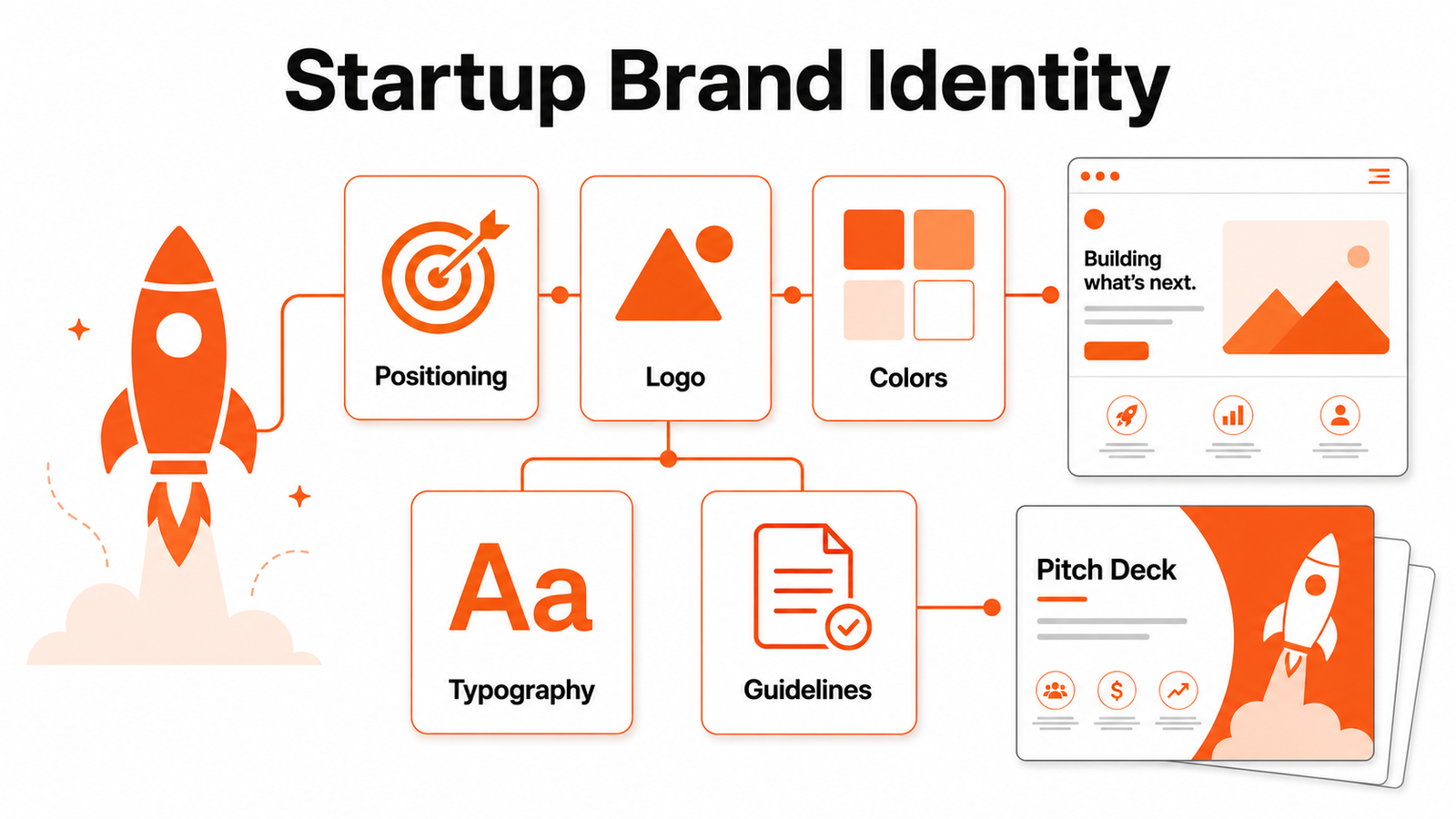
Right now, your startup may have a product, a pitch, and a few screens, but no shared way to look, sound, and feel credible. This guide shows how to create a brand identity for a startup without turning branding into a six-week detour. By the end, you will have a positioning line, a visual system, a voice guide, a basic asset folder, and a launch checklist your team can actually use. We have built this kind of identity system for early-stage teams that needed to move fast, look trustworthy, and stop redesigning the same slide, ad, or homepage section every week.
What is a startup brand identity?
A startup brand identity is the working system that makes your company recognizable across every public touchpoint. It includes your positioning, logo, colors, type, image style, voice, core messages, social templates, deck rules, and the practical do-and-don't examples that help people use those choices without guessing. It is not a moodboard alone. It is not a logo file sitting in a drive. It is the shared language that lets a founder, designer, marketer, sales rep, and developer present the same company.
The best answer to how to create a brand identity for a startup starts with a narrow definition: make the company easy to recognize, easy to trust, and easy to explain. A mature enterprise can spend months on brand architecture. A startup needs the smallest complete system that can survive a pitch deck, website, investor memo, LinkedIn launch, product onboarding flow, and first few campaigns.
Think of brand identity as the operating layer between strategy and execution. Strategy decides who you serve, what problem you solve, and why your approach is different. Identity turns that decision into repeatable choices. If your team cannot tell which logo version, color, headline style, or tone to use, the identity is not finished yet.
Why brand identity matters before your startup scales
When founders ask how to create a brand identity for a startup, they often expect a visual checklist. The deeper issue is trust. A prospect, investor, or candidate usually forms an opinion before they read your full pitch. They see a homepage hero, a LinkedIn post, a demo deck, a pricing page, or an email signature. If those pieces feel unrelated, the company feels less deliberate than it may actually be.
Strong identity also saves time. Without guidelines, every new asset becomes a small brand debate. Which orange? Which button style? Should screenshots have a device frame? Is the tone casual or formal? Those tiny choices drain focus from product, sales, and customer work. A simple identity system gives the team defaults, so creative energy goes into message quality instead of formatting.
Identity matters for hiring and fundraising too. Early employees want to join a company that knows what it is building. Investors want to understand the market, promise, and differentiation quickly. The brand does not replace traction, but it can make traction easier to explain. If the identity clarifies the story, every conversation starts a few steps ahead.
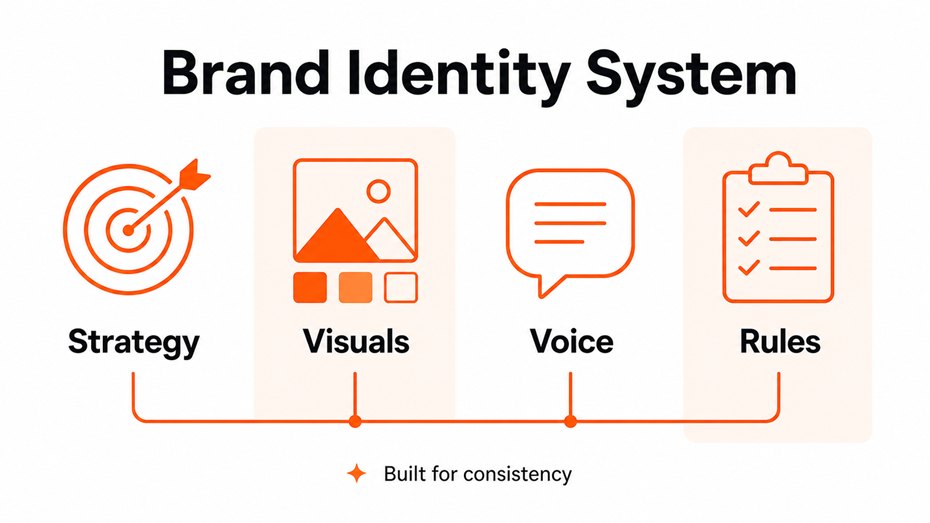
Figure 1: A complete startup identity connects strategy, visuals, voice, and rules.
How to create a brand identity for a startup without slowing down
The practical way to answer how to create a brand identity for a startup is to move from proof to assets in five focused passes. Do not begin with fifty logo sketches. Begin with the market reality: who is the buyer, what pain is urgent, what alternatives exist, and what promise your startup can make without overclaiming.
First, write a one-page brand brief. Include the audience, primary use case, top competitor alternatives, category, positioning line, proof points, forbidden claims, and three tone words. The tone words should be behavioral, not decorative. For example, "plainspoken, exact, optimistic" is more useful than "modern, bold, disruptive." A designer can act on behavioral language.
Second, choose the identity primitives: logo direction, color palette, type scale, icon style, photography or illustration rules, and layout rhythm. Start with fewer choices than you think you need. A two-color palette, two type styles, one button style, and one illustration direction beat a huge brand book nobody follows.
Third, pressure-test the system on real assets. Put it on a website hero, a pricing card, a pitch deck title slide, a LinkedIn carousel, and an outbound email header. If the system only works on a beautiful presentation mockup, it is not ready. This is where teams often use UX design for websites to connect identity decisions with actual user flows instead of treating the brand as decoration.
Fourth, document the rules in a short guide. The guide should show examples, not just principles. Include logo spacing, color values, typography levels, button samples, image rules, voice examples, and common mistakes. Fifth, launch the system through a clean asset folder and owner. Someone should know where the newest logo, deck template, social template, and web components live.
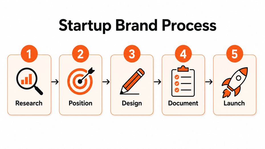
Figure 2: A founder-friendly process keeps brand work tied to real launch assets.
Build the strategy before touching the logo
A good logo cannot rescue unclear positioning. Before design begins, write the sentence your team will repeat for the next quarter: "We help [audience] achieve [outcome] without [pain]." This is not ad copy yet. It is a decision filter. If two founders write different versions, stop and align before spending on visual work.
Competitive research should be practical. Collect five competitors, five adjacent brands, and five brands your audience already trusts. Look at naming patterns, color habits, category language, promise style, and visual sameness. Your job is not to be weird for its own sake. Your job is to be distinct enough to be remembered and familiar enough to be understood.
If you are naming a new startup or product, build a clearance step into the process. A quick search is not legal advice, but the USPTO trademark search system is a sensible early check before you fall in love with a name, buy domains, and design a full identity around a mark that may be difficult to protect.
This is also where a startup decides its category language. Are you a workflow automation platform, a managed service, an AI copilot, or a marketplace? Each category creates expectations. The brand identity should reinforce the category when clarity matters and challenge it only where differentiation is meaningful.
Turn the strategy into a visual system
Once the positioning is tight, the visual system can do its job. The logo should be simple enough to work in a browser tab, social avatar, deck footer, product header, and invoice. The color palette should include primary, secondary, background, text, border, success, warning, and error values if the startup has software screens. The typography should cover headings, body copy, captions, buttons, and data labels.
This is the stage where how to create a brand identity for a startup becomes a design production question. Your team needs master files, export formats, usage examples, and naming conventions. If the final folder has six files called final-logo-new-new.png, the brand system will fall apart the first time a marketer builds a campaign under deadline.
Color deserves special care. A startup can love a color and still need accessible combinations. The W3C's WCAG 2.2 guidance says normal text should have a contrast ratio of at least 4.5:1 against its background, with lower requirements for large text. Use that as a quality bar for web copy, dashboards, forms, and ads, not just a compliance afterthought. The W3C contrast guidance is a useful reference when designers and developers are finalizing tokens.
For many early-stage teams, the smartest move is to create a compact identity kit before a full brand book. Include a primary logo, one-color logo, favicon, color tokens, typography rules, icon style, social post template, pitch deck cover, website section examples, and a short voice guide. If you need help building those assets fast, Optivanced offers brand identity design that turns the strategy into reusable files rather than one-off artwork.
Create a voice that sounds like a real company
Visual identity gets attention, but voice carries the relationship. A startup voice guide should answer four questions: how direct are we, how technical are we, how warm are we, and what do we never say? A cybersecurity startup, a wellness app, and a B2B finance platform should not sound like they came from the same template.
Build the voice guide from real touchpoints. Write example homepage headlines, product empty states, social captions, sales follow-ups, support replies, and investor one-liners. Show before-and-after rewrites. A rule like "sound confident" is vague. A rewrite from "unlock powerful synergies" to "cut reporting time from hours to minutes" teaches the team what confidence actually looks like.
The voice should also handle objections. If buyers worry about price, complexity, migration, or security, the brand should have language that meets those concerns directly. This is where brand identity connects with conversion. The visual system earns attention; the message earns the next click, reply, demo, or trial.
Benefits founders feel when the system is working
A working identity system does not make every asset look identical. It makes every asset feel related. The landing page, deck, email, ad, and product screen can serve different jobs while still feeling like the same company. That consistency is what helps people remember you after several disconnected interactions.
The second benefit is speed. A founder can brief a designer in minutes because the rules already exist. A marketer can create launch graphics without inventing a new layout. A developer can choose tokens instead of sampling colors from screenshots. This is why how to create a brand identity for a startup should end with reusable standards, not just a beautiful reveal presentation.
The third benefit is cleaner decision-making. You can judge new ideas against the identity: does this support the promise, audience, tone, and visual system? If yes, refine it. If not, park it. The brand becomes a filter that protects focus while the company is still fragile.
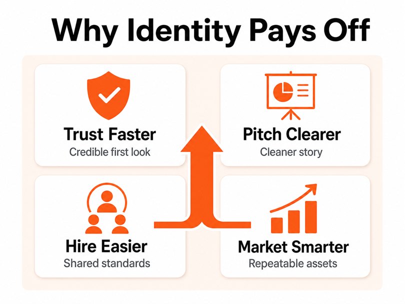
Figure 3: A usable identity improves trust, pitching, hiring, and campaign production.
Common mistakes that make startup branding feel amateur
The first mistake is starting with style references before strategy. Founders collect screenshots of brands they admire, then ask a designer to make something that feels similar. That can produce a polished surface, but it rarely creates a distinctive position. References are useful after the brief is clear.
The second mistake is overbuilding too early. A pre-seed team usually does not need a 70-page brand book, motion system, complex illustration library, or expensive photo direction. It needs a credible identity that can survive sales calls, product updates, content, and fundraising for the next stage.
The third mistake is ignoring distribution. If the brand only lives in a PDF, the team will not use it. Put templates where work happens: design files, website components, social folders, email snippets, and the deck your sales or fundraising team actually opens. When founders ask how to create a brand identity for a startup, distribution should be part of the answer.
The fourth mistake is treating social graphics and landing pages as afterthoughts. Launch assets are often the first place the public experiences the new identity. Optivanced can support that handoff with branded social graphics and conversion-focused landing pages so the identity leaves the design file and shows up in market.
A practical brand identity checklist for launch week
Before launch, create a small checklist and assign an owner. This keeps how to create a brand identity for a startup from becoming a vague creative project. The owner does not need to approve every future asset forever, but they should protect the first rollout and keep the source files clean.
- Positioning line approved by founders and customer-facing team.
- Logo exports saved in SVG, PNG, light, dark, and favicon versions.
- Color tokens documented for web, presentation, and social use.
- Typography rules tested in a real landing page and pitch deck.
- Voice examples written for homepage, social, sales, and support.
- Asset folder organized with clear names and version control.
- First 90-day review scheduled after real market feedback.
Run a 90-day review after the identity has been used in real conditions. Look for the places where the system caused friction: ads that felt off-brand, pages that needed missing components, sales slides that broke the type scale, or customers who misunderstood the promise. Improve the system based on evidence, not founder boredom.
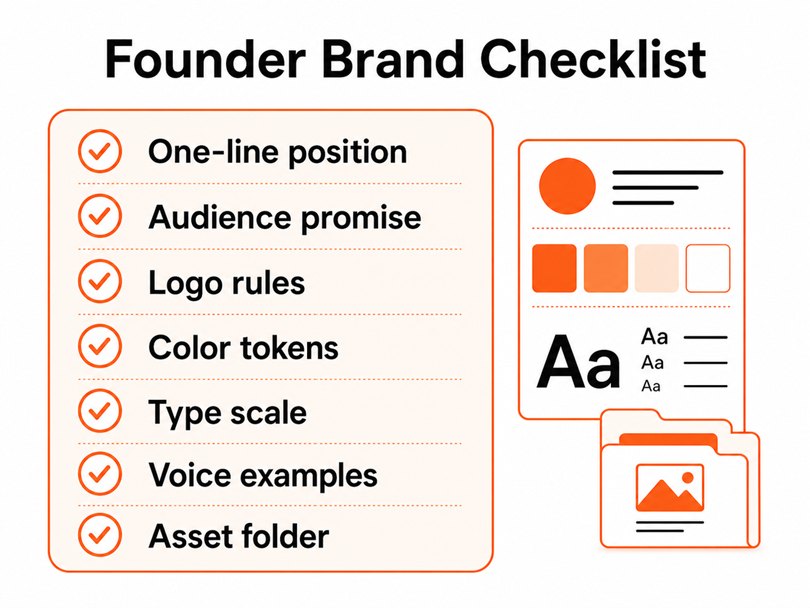
Figure 4: The launch
checklist keeps brand identity practical and repeatable.
External links and references
For legal and accessibility checks, keep authoritative references close to the workflow: USPTO trademark search for early name screening and WCAG 2.2 contrast guidance for readable color combinations. These links do not replace legal or accessibility counsel, but they keep the brand process more disciplined.
FAQs
What are the main elements of a startup brand identity?
The main elements are positioning, logo, color palette, typography, image style, voice, messaging, templates, and usage rules. Early-stage startups should keep the system compact. The goal is not to document every possible scenario. The goal is to make the most common assets consistent enough to build trust.
How much should a startup spend on brand identity?
Budgets vary by scope, market, and team. A lean identity kit can be enough for pre-seed, while a funded startup may need deeper research, web design, social templates, and investor materials. Spend enough to clarify the business and support launch, but avoid buying an enterprise-level brand program before product-market signals justify it.
Should we build the brand before or after product launch?
Build enough before launch to look credible and communicate clearly. Then improve it after real feedback. Waiting too long creates inconsistent public assets, but overbuilding too early can slow learning. The best path is a minimum complete identity, followed by a structured review after the first campaigns and customer conversations.
What is the difference between branding and brand identity?
Branding is the broader process of shaping how people understand and remember the company. Brand identity is the tangible system that expresses that strategy: visuals, voice, templates, and rules. Branding decides the meaning. Identity makes that meaning visible and repeatable across touchpoints.
Can a startup change its brand identity later?
Yes. Most startups refine their identity as the audience, product, and market position become clearer. The key is to avoid random changes. Update the system when evidence shows confusion, poor fit, accessibility problems, or a stronger market position. Rebranding should support strategy, not founder restlessness.
Final Thoughts
A startup brand identity should make the company easier to understand, remember, and trust. The strongest systems are not the most elaborate; they are the ones the team can use under pressure without asking for a new design decision every time.
The mistake to avoid is treating brand as a launch decoration. Make it a working system that connects positioning, design, voice, and real assets. If you would rather not build this from scratch, our team at Optivanced does it every week through graphic design services. Want a custom plan for your business? Get a free quote and we will send you a tailored proposal within one business day.