
Most infographics do not fail because they are ugly. They fail because they are crowded, unsourced, hard to read on a phone, or published with no distribution plan. This guide explains how to create an infographic that goes viral by starting with a share-worthy insight, turning it into a clear visual story, and giving people a reason to pass it along. By the end, you will have a research framework, a design workflow, and a promotion checklist. At Optivanced, we build infographics as useful assets first and decorative graphics second.
What Does It Mean to Create an Infographic That Goes Viral?
Viral does not mean random luck. It means a piece of content travels beyond the audience that originally received it. For an infographic, that usually happens when the visual makes someone feel smarter, surprised, validated, or equipped to explain something to another person.
The strongest infographics usually have one of three engines: a surprising comparison, a useful framework, or a timely explanation. A chart that reframes a familiar problem can travel because people want to use it in meetings, newsletters, social posts, and articles. A checklist can travel because it saves people time. A myth-busting visual can travel because it gives people a clean way to challenge a common belief.
That is why learning how to create an infographic that goes viral starts before design software. If the idea is weak, the layout has to shout. If the idea is strong, the layout can guide. Our infographic design team helps businesses turn messy research, reports, and offers into visual assets that are clear enough to share.
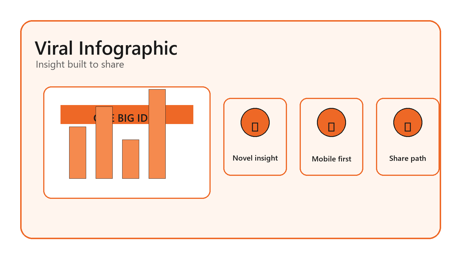
Start With a Share-Worthy Insight, Not a Template
Templates are useful after the story is clear. They are dangerous when they decide the story for you. Begin with the audience and the tension: what do they believe, what do they struggle to explain, what changed recently, or what number would make them stop scrolling?
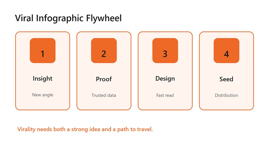
A viral infographic flywheel needs insight, proof, design,
and distribution.
Research by Jonah Berger and Katherine Milkman on viral content found that high-arousal emotions can increase sharing. That does not mean every infographic should be angry or sensational. It means the topic needs energy: surprise, awe, urgency, practical relief, or a sharp information gap. A flat “10 facts about our industry” graphic has less momentum than a visual that resolves a question people already care about.
Use a one-sentence test before designing: “This infographic helps [audience] understand [important tension] so they can [action].” If that sentence is vague, keep researching. If it feels useful, you have the beginning of a shareable asset.
Verify the Data Before You Visualize It
Nothing damages an infographic faster than a confident but unsupported number. Use primary sources when possible: platform docs, government datasets, peer-reviewed research, original survey data, or well-known industry reports. When you use a secondary source, trace the statistic back to its origin. If the source is old, unclear, or circularly cited, leave it out.
A viral graphic is often copied without its original context, so the source notes need to be baked into the asset and repeated in the post that hosts it. Use short source labels inside the graphic and fuller citations below the image. If a number is an estimate, label it as an estimate. Honesty keeps shares from turning into corrections.
Data selection matters as much as data accuracy. Choose the three to seven points that carry the story. A dense graphic with 40 facts may look impressive in a design file but fail on mobile. A tight graphic with five well-chosen points can travel farther because readers can explain it from memory.
For SEO-driven campaigns, source quality also affects link earning. Journalists, bloggers, and partners are more likely to cite an infographic when the underlying claim is easy to audit. Our SEO services team can help connect the visual asset to a linkable page, search intent, and outreach list.
Design the Story Flow Before Styling
A good infographic has a path. The reader should know where to start, what to compare, and what conclusion to take away. Sketch that path before choosing colors or icons. Use a headline, short subhead, section labels, visual hierarchy, and one final takeaway.
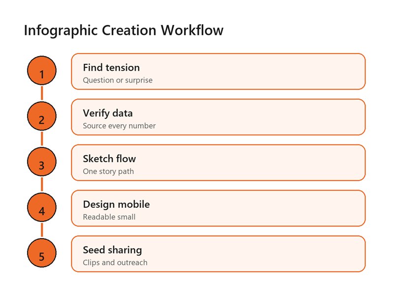
A practical workflow moves from tension to data, sketch,
mobile design, and sharing.
Match the chart to the job. Use bars for comparisons, lines for trends, maps for geography, timelines for sequence, and simple callout cards for key facts. Avoid decorative 3D charts, overloaded pie charts, and icon arrays that make people count tiny shapes. The chart should reduce effort, not add puzzle work.
Typography should be boring in the best way. Use one strong display style for headings and one readable style for labels. Keep body copy short, avoid long paragraphs inside the graphic, and use spacing to group related ideas. If you need tiny text to make everything fit, the infographic is trying to say too much.
Branding should be present but not heavy-handed. A small logo, consistent colors, and a clear source URL are enough. If the graphic reads like an ad before it reads like a useful idea, people have less reason to share it.
Make It Mobile-Readable and Accessible
Many infographics are designed as giant desktop posters, then posted into mobile feeds where every label becomes dust. Design for the smallest important view first. Break long graphics into carousel panels, create a cropped social preview, and keep the full version on a landing page where it can breathe.
Accessibility is not optional if you want broad distribution. W3C guidance on non-text contrast notes that infographics often fail criteria such as non-text content, use of color, contrast, and images of text. Use sufficient contrast, do not rely on color alone, write meaningful alt text, and provide a text summary near the graphic.
WCAG's contrast guidance gives a practical baseline: normal text should have at least 4.5:1 contrast, while large-scale text can meet a 3:1 ratio. Even if your campaign is not a formal compliance project, those ratios are useful because a viral infographic will be viewed on dim phones, bright outdoor screens, compressed social previews, and low-quality reposts.
For social distribution, create platform-native crops. A tall infographic may need a LinkedIn carousel, Instagram carousel, Pinterest pin, blog hero image, and email preview. Our social media post design service can adapt one visual story into the formats people actually share.
Give the Infographic a Distribution Plan
Publishing is not distribution. If the infographic sits on a blog post with no outreach, no teaser images, and no email angle, it is relying on luck. Plan distribution before the final export. Decide who would benefit from sharing it and why their audience would care.
Build a launch kit: one full infographic, three cropped social cards, a short email pitch, a plain-language summary, embed code if appropriate, and a few prewritten captions. Send it to partners, newsletters, niche communities, journalists, sales teams, and internal subject-matter experts. The easier it is to reuse, the more likely it travels.
Timing matters too. Connect the infographic to a seasonal moment, new regulation, platform update, product launch, industry event, or public debate. A useful visual released at the right moment can outperform a better-looking visual released into silence.
If AI tools help with ideation or variations, keep human judgment in charge. AI can speed up layout exploration, caption ideas, and image variants, but it can also hallucinate data or create unreadable text. Our AI creative content and video studio can help turn one infographic into campaign variations while preserving accuracy.
Benefits of Creating Shareable Infographics
A shareable infographic can become a campaign asset, a sales aid, a linkable resource, a social post series, and a newsletter feature. The value is not only the first wave of shares. The value is that one clear visual can explain a complex point again and again.
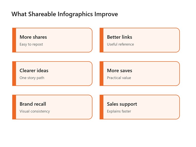
Shareable infographics can improve shares, links, clarity,
saves, brand recall, and sales support.
Infographics also help teams align. A sales team can use the same visual in a proposal. A social team can turn it into carousels. A blog team can use it to make an article more useful. A leadership team can use it to explain a strategic shift.
The hidden benefit is discipline. To make a strong infographic, you must decide what the message is, which data supports it, and what action the reader should take. That clarity often improves the entire campaign around it.
Common Mistakes That Stop Infographics From Spreading
- Starting with a template before the core insight is clear.
- Using unsupported statistics or vague source labels.
- Trying to include every fact from the source report.
- Choosing decorative charts that make data harder to compare.
- Designing only for desktop instead of mobile and social previews.
- Forgetting alt text, contrast, and a text summary.
- Publishing without a seeding, outreach, or repurposing plan.
The most common mistake is mistaking visual complexity for authority. A busy infographic may look expensive, but it often asks too much of the reader. The reader should leave with one memorable idea, not a headache.
Another mistake is designing for awards instead of use. The graphics that travel are often the ones people can crop, quote, explain, and send to a colleague. Make reuse easy, and the infographic has a better chance to leave your own feed.
A Practical Checklist for Viral Infographic Readiness
Use this checklist before publishing. Can a reader explain the main idea in one sentence? Are the sources visible and credible? Does the first screen work on mobile? Is the title short and specific? Are chart choices accurate? Is there a text summary for accessibility? Do you have at least three social crops and a list of people or communities likely to share it?
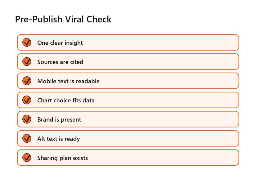
A pre-publish checklist keeps viral infographic work
grounded in clarity, sources, accessibility, and distribution.
This is the practical answer to how to create an infographic that goes viral: make the reader look smart for sharing it. The graphic should be accurate enough to trust, simple enough to understand, and useful enough to send onward.
A second way to think about how to create an infographic that goes viral is to design for the person who will repost it. Give them a clear caption angle, a credible source trail, and a visual crop that still makes sense outside the original article.
Teams that document how to create an infographic that goes viral also get faster over time. They stop treating every visual as a blank-page project and start reusing proven story shapes: comparison, checklist, myth, timeline, map, teardown, and decision tree.
Measure beyond likes. Track saves, shares, backlinks, embeds, referral traffic, newsletter clicks, sales conversations, and whether people quote the core idea correctly. Those signals tell you whether the infographic traveled and whether it carried the message you intended.
Document what worked. Save the topic, headline, data sources, visual format, distribution channels, and strongest sharing angle. Over time, your team will learn which kinds of visual stories spread in your market instead of guessing from general viral-content advice.
That learning loop is what turns how to create an infographic that goes viral from a hope into a repeatable creative process.
FAQs
Can you guarantee an infographic will go viral?
No. Virality depends on audience timing, topic relevance, distribution, and network effects. You can improve the odds by choosing a useful insight, citing credible sources, designing for fast comprehension, and seeding the graphic where the right audience already pays attention.
What type of infographic is most shareable?
The most shareable formats are usually surprising comparisons, practical checklists, myth-versus-fact visuals, timelines, decision trees, and simple frameworks. The best format depends on the story. Choose the structure that makes the reader understand or explain the idea fastest.
How much data should an infographic include?
Use only the data needed to support the main story. Three to seven strong points are often better than 30 weak ones. If the source report is dense, create a focused visual summary and link to the full source for readers who want detail.
Where should I publish an infographic?
Host the full version on your website, then adapt it into social crops, carousel slides, newsletter images, and outreach assets. A landing page gives the graphic a permanent home, while platform-specific versions make it easier for people to share.
Should I use AI to create infographics?
AI can help brainstorm angles, summarize research, draft captions, and explore layouts. Do not let it invent statistics or final text without review. Human verification, source checking, accessibility review, and brand judgment are still essential.
External Links Referenced
Research on viral sharing and arousal: PubMed: Arousal increases social transmission of information
Accessible infographic contrast guidance: W3C Understanding Non-text Contrast
Text contrast baseline: W3C Understanding Contrast Minimum
Viral content research explainer: Scientific American on viral content
Final Thoughts
A viral infographic is not just a pretty long image. It is a useful idea, supported by trustworthy sources, designed for fast understanding, and distributed with intent. The mistake to avoid is polishing a weak message instead of sharpening the insight. If you would rather not build this from scratch, our team at Optivanced does it every week through custom infographic design. Want a custom plan for your business? Get a free quote and we will send you a tailored proposal within one business day.