
Most indie authors do not lose the click because their story is weak; they lose it because the cover asks readers to work too hard. This guide explains how to design a book cover for self-published authors who need a cover that looks credible at thumbnail size, fits the right shelf, and survives print upload checks. By the end, you will have a research method, a design workflow, and a pre-publish checklist you can hand to a designer or use before building the cover yourself. At Optivanced, we treat cover design as conversion work first and artwork second.
What Is a Self-Published Book Cover Really Supposed to Do?
A self-published cover is not only a front panel. It is a marketplace signal, a genre promise, a quality cue, and a production file. That is why a good brief starts with the reader's buying context instead of the author's favorite scene. On Amazon, Kobo, Apple Books, Goodreads, TikTok, newsletters, and paid ads, the cover appears as a small rectangle surrounded by competing books. The job is to make the right reader understand three things quickly: what kind of book this is, why it feels relevant, and whether it looks professional enough to trust.
This is also why the question of how to design a book cover for self published authors should not begin with software. Canva, Photoshop, Affinity, Adobe Express, and Figma can all produce a usable file. The bigger difference is judgment: choosing the right visual language, simplifying the composition, checking rights, exporting the correct format, and resisting details that disappear when the cover is 100 pixels wide. A beautiful full-size cover that fails as a thumbnail is usually a poor commercial cover.
Think of the cover as a compact sales page. The title is the headline. The subtitle or tagline is the supporting promise. The image sets emotional expectation. The author name creates recognition over time. For print, the spine and back cover add another layer: shelving, barcode placement, trim, bleed, and copy hierarchy. None of those decisions should be left until the final export.
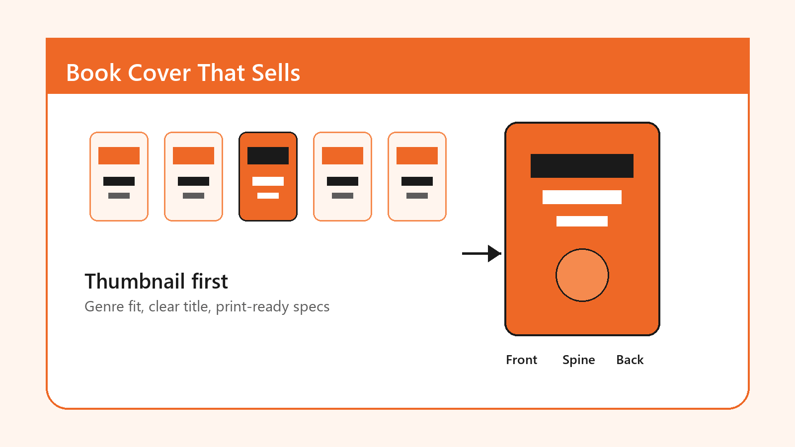
Why Book Cover Design Matters for Indie Authors
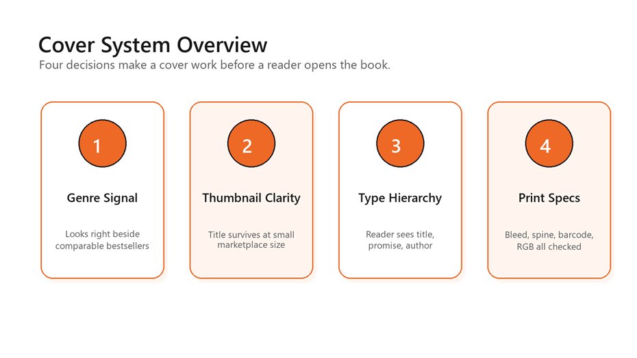
A practical cover system balances genre fit, thumbnail
clarity, typography, and print specifications.
A traditional publisher has a sales team, distribution relationships, catalog placement, and brand familiarity behind the book. A self-published author often has a product page, a cover, a blurb, early reviews, and a launch plan. That imbalance makes the cover work harder. It has to reduce doubt before the buyer reads the description. It also has to look coherent across the author website, launch graphics, email banners, and retailer listings.
If you want the cover to support a broader author platform,
Optivanced can connect the front-cover concept with brand identity design, social assets, and
reusable visual rules. That matters because authors rarely publish only one
asset. They need a system that can become a series look, a preorder campaign, a
launch carousel, and a reader magnet graphic without starting over each time.
The best covers also create useful constraint. When you know the shelf, the reader, the emotional tone, and the technical requirements, you can stop chasing random inspiration. A thriller cover can be spare and tense. A cozy mystery can be warm, illustrated, and characterful. A practical nonfiction cover can use strong typography and one obvious metaphor. A memoir may need intimacy without looking generic. The point is not to copy the category. The point is to enter the category clearly enough that your twist makes sense.
That clarity is the thread running through this guide. You are not designing a poster for your wall. You are designing a buying signal for strangers who have never heard of you and are comparing your book with titles that already look established.
Research the Shelf Before You Touch the Layout
The fastest way to improve a cover is to stop designing in isolation. Start with a shelf audit. Search the exact category where the book will compete, then collect 20 covers from the top sellers, new releases, and sponsored listings. Do not judge them as art yet. Study the pattern. Which colors repeat? How large are the titles? Are the covers illustration-led, type-led, photo-led, or symbol-led? Do authors use full names, initials, credentials, or series labels? Which covers look expensive even before you know why?
This research gives you the design boundaries. If every high-performing military sci-fi cover uses scale, machinery, and hard contrast, a pastel handwritten cover may signal the wrong promise. If business books in the category lean toward clean typography and one memorable metaphor, a crowded montage can feel amateur. If romance covers split into illustrated rom-com, moody dark romance, and photographic contemporary styles, pick the sub-shelf before choosing imagery.
A simple audit sheet should capture the title treatment, image style, color palette, author-name size, subtitle use, and emotional promise for each comparable book. Then write one positioning sentence: 'This book should feel like [genre expectation] with [specific difference].' That sentence becomes the guardrail for every design choice.
- Compare covers at thumbnail size, not only full screen.
- Sort competitors by subgenre, reader promise, and price point.
- Flag details that repeat across bestsellers: title scale, color contrast, image type, and author-name placement.
- Avoid choosing a cover direction because one isolated image looks attractive.
How to Design a Book Cover for Self Published Authors: A Practical Workflow
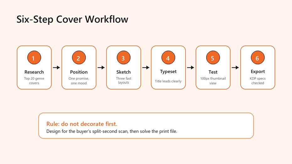
Use the same sequence every time: research, position,
sketch, typeset, test, then export.
Here is the workflow we recommend when someone asks how to design a book cover for self published authors without wasting weeks on subjective revisions. First, define the shelf. Second, define the reader promise. Third, sketch three simple layouts before choosing imagery. Fourth, build the type hierarchy. Fifth, test the cover as a thumbnail beside real competitors. Sixth, export separate files for ebook, paperback, hardcover, and launch graphics.
The sketch step is where many DIY covers go wrong. Authors often begin with a finished stock image or AI concept, then try to force the title around it. Reverse that order. Start with the title block, because the title is usually the most important conversion element. Place the title at the scale it needs to read small. Add the author name. Add a subtitle only if it earns the space. Then introduce imagery that supports the promise instead of fighting the typography.
For fiction, imagery usually carries mood: danger, tenderness, mystery, scale, humor, or intimacy. For nonfiction, imagery often clarifies the problem or outcome. A leadership book may need authority. A nutrition guide may need freshness and simplicity. A workbook or guide may need clarity more than drama. The same rule applies in every category: one dominant idea beats five clever details.
Once the concept is working, move into production checks. Export the ebook cover as a clean portrait file. Build the print wrap only after the final page count, trim size, paper type, and platform are known. KDP's own ebook cover criteria list ideal dimensions of 2,560 pixels high by 1,600 pixels wide, a minimum of 1,000 by 625 pixels, RGB color, and a file under 50MB, so the final export should be planned rather than guessed.
For technical reference, review KDP's eBook cover image criteria before final upload.
If you would rather hand this workflow to a specialist, our book cover design team can translate the shelf audit into ebook, print, and launch-ready cover assets.
Typography, Color, and Visual Hierarchy That Survive the Thumbnail Test
Typography is where amateur covers reveal themselves fastest. The title should win the first glance. The author name should support credibility or recognition. The subtitle should clarify the promise without becoming a second headline. If a cover needs five type sizes, three font families, a curved tagline, and a quote on the front, it is probably asking the reader to decode too much.
Use one display face for the title and one supporting face for secondary text. That does not mean bland. It means controlled. A fantasy title can use a dramatic custom letterform, but the subtitle should remain readable. A business book can use a bold sans serif and a restrained serif accent, but the hierarchy still needs to be obvious. The test is simple: shrink the cover to phone-search size. If the title collapses, simplify.
Color should match both genre and contrast needs. Dark thrillers often rely on black, red, silver, or high-contrast photographic drama. Cozy categories often use lighter palettes and illustration. Practical nonfiction frequently works with one strong accent color and generous whitespace. Do not pick colors only because they feel personal. Pick them because they help the book look properly shelved and legible.
A useful hierarchy check is to blur your eyes and name what you see first, second, and third. The answer should usually be title, image promise, author or subtitle. If the reader sees a texture first, a tiny character second, and the title third, the design is losing the commercial order. That is one reason the thumbnail test appears in nearly every strong guide on how to design a book cover for self published authors: it exposes hidden clutter immediately.
For authors building sales pages, preorder graphics, and reader magnets around the same visual system, our infographic design and launch-visual work can keep the campaign coherent without making every asset look identical.
Print and Ebook Specifications: The Part You Cannot Fix With Taste
A cover can look excellent and still fail upload if the file is built against the wrong dimensions. Ebook covers are usually front-cover-only portrait images. Print covers are full wraps that include the back cover, spine, front cover, bleed, safe area, and barcode space. The print file depends on trim size, final page count, paper type, and binding. That means you should not finalize a paperback wrap before the interior is finished.
KDP's paperback guidance is specific: cover size includes bleed, and the full cover width is calculated as bleed plus back cover width plus spine width plus front cover width plus bleed. Cover height is bleed plus trim height plus bleed. KDP also states that text on the spine requires at least 79 pages, with spine width based on page count and paper type. White paper for black-and-white books uses page count multiplied by 0.002252 inches, while cream paper uses page count multiplied by 0.0025 inches.
Use the official KDP paperback cover requirements when calculating bleed, spine width, safe area, and file setup.
The practical takeaway is boring but valuable: make the final print template from the publishing platform, then design inside it. Keep important text inside safe areas. Extend backgrounds past trim. Leave barcode space alone unless the platform tells you otherwise. If you plan to publish through multiple distributors, check each platform separately. A cover that passes one print-on-demand system may need small adjustments for another.
For ebook-only launches, the discipline is different. You need crisp pixels, minimal compression, clear title rendering, and a cover that does not disappear on a white product page. If the artwork uses a very light background, consider a subtle border or contrast device so the cover edge remains visible.
Benefits of a Strong Cover System
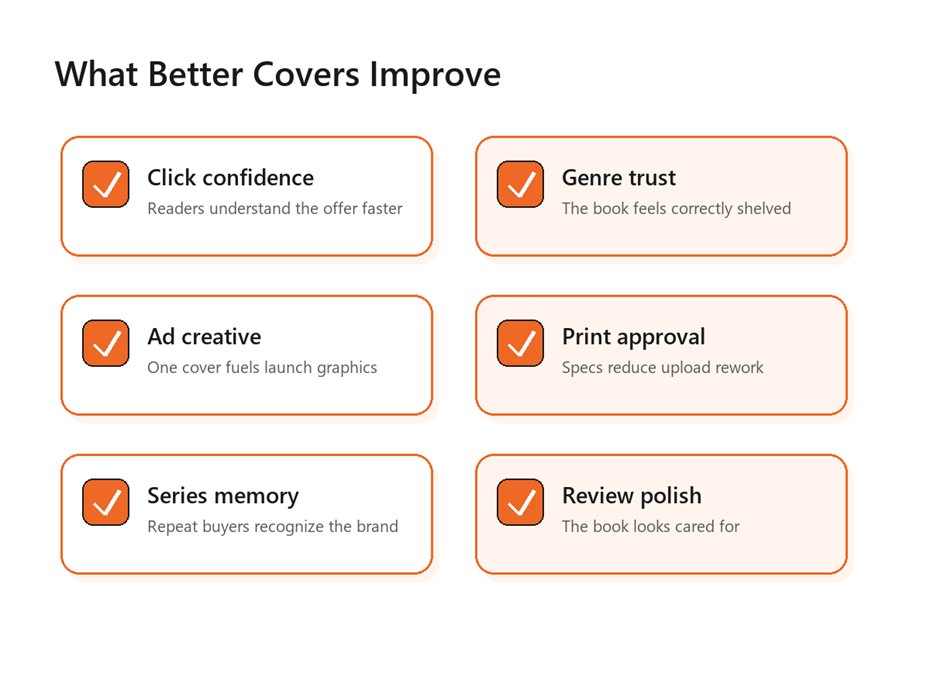
A strong cover improves more than the book page; it
supports recognition, launch assets, and print approval.
A strong cover system creates leverage. The front cover sells the click. The spine supports the physical book. The back cover helps a browser keep reading. The color, type, and image rules become a base for launch graphics, author banners, podcast thumbnails, paid ads, and series extensions. That is why a good design process feels slightly slower at the beginning and much faster near launch.
It also helps authors make better marketing decisions. If the book is a series starter, the cover should leave room for repeatable elements: a series label, a consistent author-name treatment, a recognizable composition, or a shared color logic. If the book is nonfiction, the cover can support the author's professional positioning by aligning with the website, speaker deck, lead magnet, and LinkedIn presence.
The strongest answer to how to design a book cover for self published authors is not 'make it pretty.' It is 'make it do its job in every channel where the book appears.' That includes retailer thumbnails, social previews, email promotions, book fair flyers, author copies, audiobook thumbnails, and the product page itself.
If the cover will anchor a launch campaign, connect it with branded social graphics so the same visual promise follows the reader from discovery to purchase.
Common Mistakes That Make DIY Covers Look Self-Published
The first mistake is overcrowding. Authors know every symbol in the story, so they often want all of them on the front. Readers do not have that context. They need one clear promise. If the cover contains a city skyline, a sword, a face, a handwritten letter, a moon, a quote, and a subtitle, the design is probably trying to summarize the book instead of selling it.
The second mistake is weak type. Decorative fonts can look exciting at full size and collapse at thumbnail size. Thin scripts, low contrast, narrow spacing, and long subtitles are especially risky. Type should be chosen for tone and performance, not novelty.
The third mistake is ignoring rights. Stock imagery, AI-assisted art, fonts, textures, and mockups all have license terms. Commercial publishing requires permission that covers the format, territory, and use case. If the cover will appear in ads, print, merchandise, or a broad campaign, verify those rights before launch. AI imagery can be useful for concepting, but it still needs quality control, uniqueness checks, and professional typography.
The fourth mistake is treating print as a last-minute export. A front cover is not a paperback wrap. You still need the back-cover copy, author bio, barcode area, spine math, bleed, and safe zones. Many rejected files are not bad designs; they are files built from the wrong assumptions.
KDP's content quality guide lists common cover issues such as blurry images, missing covers, covers inserted into the manuscript, and covers with advertisements. See KDP's Kindle content quality guidance for the official checklist.
A Pre-Publish Checklist for Authors and Designers
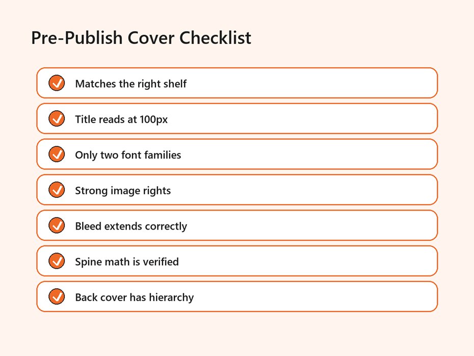
Before upload, confirm the shelf, title clarity, rights,
bleed, spine math, and back-cover hierarchy.
Use this checklist before you approve a final cover. It works whether you designed the file yourself, hired a freelancer, or asked an agency to build the complete visual system. The point is to make the review practical rather than emotional.
- Place the cover beside 10 to 20 current books from the same subgenre and check whether it belongs on that shelf.
- Shrink the cover to roughly marketplace thumbnail size and confirm that the title is still readable.
- Read every word on the front, spine, and back cover out loud to catch spelling and hierarchy issues.
- Confirm image, font, illustration, and AI asset rights for commercial use.
- Build ebook and print files separately, using the correct platform template for print.
- Check bleed, safe areas, barcode space, trim size, page count, and spine text rules.
- Export a proof, view it on phone and desktop, and order a physical proof if the book will be printed.
This final review is where a professional process earns its keep. A designer may see spacing, contrast, or alignment issues that the author misses. An author may catch a genre mismatch the designer did not fully understand. Both perspectives matter. The cover is strongest when creative taste and publishing mechanics meet in the same review.
For authors who need a complete launch package, Optivanced's
UI/UX and graphics design services can combine
cover artwork, brand rules, launch graphics, and conversion-focused visuals in
one workflow.
External Links and Sources
- Amazon KDP eBook cover image criteria: dimensions, file type, file size, color profile, and quality notes.
- Amazon KDP paperback cover requirements: bleed, spine width, safe area, and cover-size calculations.
- Amazon KDP content quality guidance: common cover issues such as blurry images, missing covers, and illegible image text.
Source link: KDP eBook cover image criteria
Source link: KDP paperback cover requirements
Source link: KDP content quality guidance
FAQs
Can I design my own book cover as a self-published author?
Yes, but only if you treat it as a publishing asset, not a personal art project. Start with a shelf audit, keep the title readable, use legally cleared images and fonts, and test the result beside competing books. If the design still looks amateur at thumbnail size, hire help before launch.
What size should my ebook cover be for KDP?
KDP lists ideal ebook cover dimensions as 2,560 pixels high by 1,600 pixels wide, with RGB color and a file under 50MB. Build at high quality, avoid heavy compression, and preview the cover on multiple devices before upload.
Should my ebook and paperback covers be different?
They should share the same front-cover idea, but the production files are different. The ebook cover is a single portrait image. The paperback cover is a full wrap with back cover, spine, bleed, safe areas, and barcode space. Design them as related assets, not one file reused everywhere.
How many fonts should a book cover use?
Most covers should use one or two font families. A display font can carry the title, while a simpler supporting font handles subtitle, author name, and back-cover copy. More fonts usually weaken hierarchy unless a skilled designer is using them intentionally.
Can I use AI images on a book cover?
AI images can help with mood boards and concept exploration, but they need careful review. Check commercial-use terms, look for visual artifacts, avoid copied-looking styles, and pair the artwork with professional typography. For many genres, custom illustration or licensed stock is still safer.
What is the easiest way to test a cover before publishing?
Shrink it to thumbnail size, place it beside current bestsellers in the same category, and ask unfamiliar readers what genre they think it is. Then view it on a phone, desktop, and print proof if applicable. Confusion at this stage is cheaper than a weak launch.
Final Thoughts
A strong book cover makes the right promise before the first sentence of the sample. It does not need to explain the entire manuscript; it needs to earn the reader's next click. The most common mistake is designing for personal meaning while ignoring shelf fit, thumbnail clarity, and print mechanics.
If you would rather not build this from scratch, our team at
Optivanced does it every week through ebook and print cover design. Want a custom
plan for your business or author brand? Get a free quote and we will send you a
tailored proposal within one business day.