
A SaaS dashboard earns trust in the first few seconds. If
users open it and see a crowded grid of charts, they still have to translate
data into a decision. This guide to ui ux design best practices for saas
dashboards shows how to choose the right metrics, shape a useful hierarchy, and
design states that keep people moving. By the end, you will have a role-based
planning model, a practical dashboard checklist, and a validation process your
team can use before the next release. At Optivanced, this is the same kind of
decision-first structure we bring to product screens that need to feel clear on
day one and durable after launch.
Table of Contents
What Are UI UX Design Best Practices for SaaS Dashboards?
The most useful dashboard is not the one with the most data. It is the one that helps a specific user understand what changed, why it matters, and what to do next. That distinction sounds small, but it changes the entire design process. Instead of opening Figma with a blank grid and asking which widgets look impressive, start with the user's job. A founder may need revenue health, runway risk, and expansion signals. An operations manager may need queue volume, exceptions, and team capacity. A customer success lead may need renewal risk and account activity. Each role deserves a different default view because each role carries a different decision load.
For SaaS teams, dashboard UX also has to support repeated use. A marketing landing page may be read once. A dashboard may be opened every morning, during meetings, and before urgent decisions. The interface therefore needs calm hierarchy, predictable controls, readable charts, and fast feedback. If your product team needs a research-led redesign, our UI/UX design team can turn those requirements into cleaner product flows without losing the complexity that enterprise users need.
A good dashboard answers three questions in order: what is happening, should I care, and where do I go now? When a screen answers only the first question, it becomes a reporting surface. When it answers all three, it becomes part of the product's workflow. That is the deeper promise behind ui ux design best practices for saas dashboards: less decoration, more operational clarity.
Why SaaS Dashboard UX Matters for Retention and Trust
Dashboards sit close to revenue because they are where users decide whether the software is working for them. If the page loads slowly, hides context, or shows the same priority for every number, users begin to doubt the product. They may not complain in a support ticket. They simply stop checking the dashboard and rebuild the same view in a spreadsheet, a BI tool, or a competitor's product.
The trust problem is often caused by hierarchy, not visual taste. A beautiful screen can still be hard to use if every card has the same size, every chart fights for attention, and every filter is required before the page says anything useful. A practical dashboard should reveal the default truth first, then let the user narrow, compare, and investigate.
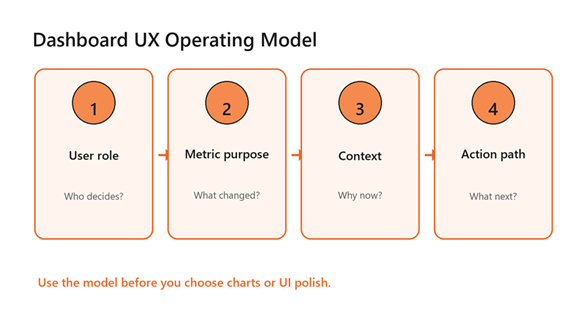
A decision-first operating model for SaaS dashboard UX.
Accessibility is part of that trust. The W3C's WCAG 2.2 recommendation includes contrast, resize text, and non-text interface guidance that should influence dashboard tokens, chart labels, and focus states. For a SaaS dashboard, that means your design system cannot rely on pale grey labels, color-only status, or tiny legends that become unreadable when the screen is busy.
Start With Decisions, Then Design the Dashboard
The strongest way to prevent metric sprawl is to write the decision statement before you draw the screen. Use a simple sentence: this dashboard helps this role decide this action at this cadence. For example, a support operations dashboard helps a team lead decide whether to rebalance queues today. A finance dashboard helps a founder decide whether growth spending is still inside the plan this month.
Once the decision statement is clear, choose three to five primary KPIs for the first view. This is not a universal law; it is a practical limit for scan speed. The dashboard can still contain deeper analytics, but the first screen should act like a triage layer. If the user needs ten minutes to discover the one metric that matters, the UX has already failed.
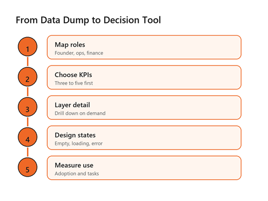
A five-step process for turning raw dashboard data into decisions.
This is where product strategy and interface design meet. A team may already have the right data, but the screen has to rank that data by urgency. Use visual hierarchy to make the primary metric obvious, support it with trend or comparison context, and place drill-down controls close to the moment of curiosity. When you need the dashboard to connect to signup paths, billing flows, or sales funnels, our conversion rate optimization specialists can help turn insight into measurable next steps.
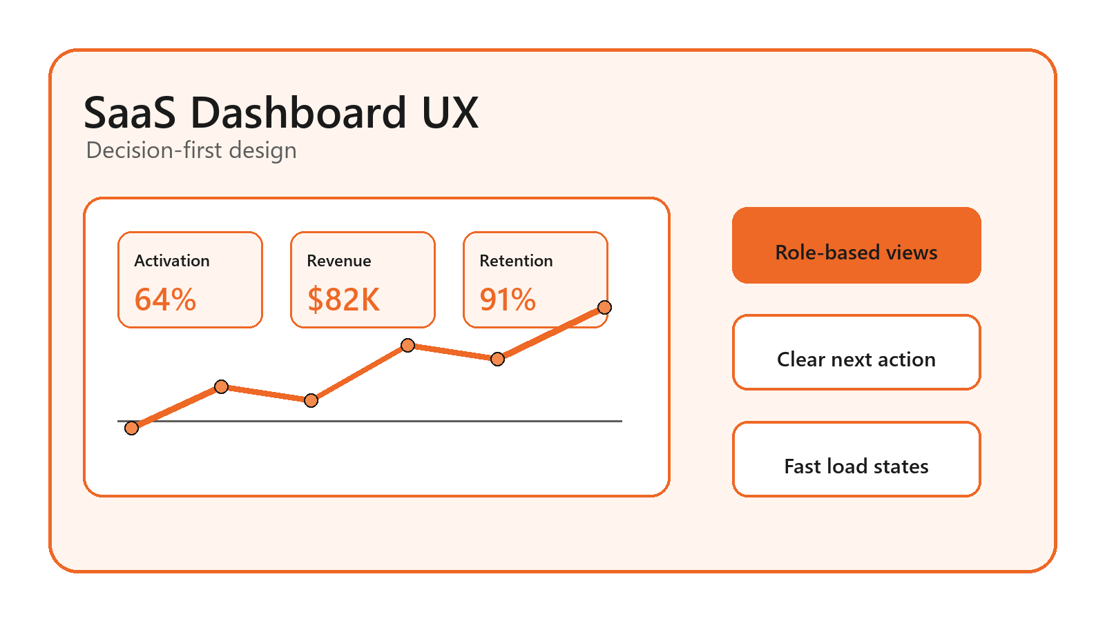
Use Role-Based Views Instead of One Universal Dashboard
Many SaaS dashboards collapse because they try to satisfy every stakeholder with one screen. The result is usually a compromise view that nobody loves. Role-based dashboard design starts with the default job for each user type. Executives need health and exceptions. Operators need queue state and next tasks. Analysts need filters, export paths, and definitions. The same database can serve all three groups, but the interface should not pretend they scan information the same way.
This practice also reduces permission complexity. If a user should not act on a metric, avoid making that metric the centerpiece of their experience. Instead, use saved views, personalized defaults, and module-level navigation to reveal the right data at the right depth. A mature SaaS product may include admin controls for custom views, but the defaults still need a strong editorial opinion.
Role-based thinking is one of the highest-leverage ui ux design best practices for saas dashboards because it forces a team to define audience, priority, and action before arguing about layout. It also makes customer onboarding easier: users see a version of the product that matches their job, not a generic analytics wall.
Design Charts for Scanning, Not Decoration
A chart is a sentence written with data. If the sentence is unclear, the chart type is probably wrong. Use line charts for time trends, bar charts for comparisons, tables for exact values, and scorecards for one current status. Avoid pie charts with many slices, decorative 3D effects, and legends that force the eye to travel back and forth. When users are tired, under deadline, or presenting in a meeting, those details create avoidable friction.
The U.S. Web Design System data visualization guidance recommends common chart types when audience data literacy is unknown and emphasizes simplicity, careful color use, and accessible supporting data. Michelin's dashboard principles make a similar point: labels, legends, titles, and chart choice should help the visual stand on its own.
In SaaS dashboards, the title should state the point, not merely name the metric. “Revenue by month” is a label. “Expansion revenue is offsetting churn” is an insight. Likewise, color should carry meaning consistently. If orange signals an alert in one module, it should not become a neutral category color in the next. For larger applications, this is where a shared component library and clear data visualization rules protect the product from slow visual drift.
Build States: Empty, Loading, Error, and Success
Dashboard UX is not only the happy path. New users see empty states. Returning users see loading states. Power users hit permission limits, sync delays, and disconnected integrations. Every one of those moments either preserves confidence or creates doubt. A blank empty state says the product has nothing to offer. A useful empty state explains what will appear, why it matters, and the one setup action that unlocks value.
Loading states deserve the same care. Skeleton screens usually feel more stable than indefinite spinners because they show the expected structure of the page. Error states should explain whether the issue is temporary, user-controlled, or system-controlled. If the dashboard depends on imported data, show the last successful sync time and the next recovery step. These details are small, but they are often the difference between a user trusting the interface and opening a support chat.
If your dashboard needs custom front-end behavior, real-time widgets, or a cleaner app shell, Optivanced can pair UX planning with full-stack web development so the design does not fall apart when it meets production data.
Benefits of Applying the Right Dashboard UX Practices
The benefits of ui ux design best practices for saas dashboards show up in product behavior before they show up in compliments. Users scan faster. They ask fewer basic interpretation questions. Teams spend less time explaining what a metric means, because labels, tooltips, and comparison context do more of that work inside the product.
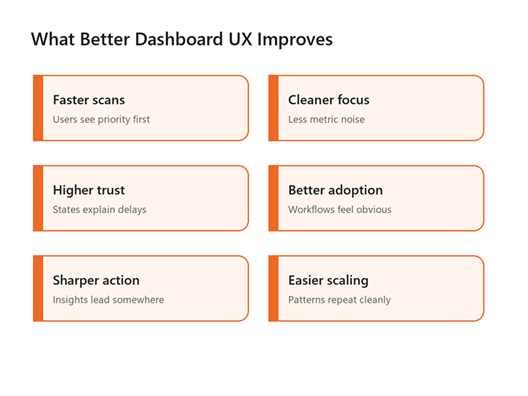
Dashboard UX improvements usually come from clarity, trust, and repeatable patterns.
Better dashboard UX also gives sales and customer success teams a stronger product story. Instead of promising that the software has many reports, they can show how the product supports a specific operating rhythm. That matters for demos, onboarding, renewals, and expansion conversations. A dashboard that teaches the workflow becomes a retention asset, not just a feature page.
The longer-term benefit is design debt reduction. Once the team has standards for KPI hierarchy, chart labels, filters, empty states, and action links, new modules become easier to ship consistently. That is especially valuable for B2B SaaS products where dashboards expand over time as customers request more roles, exports, permissions, and integrations.
Common SaaS Dashboard Mistakes to Avoid
- Designing from available data instead of user decisions.
- Giving every metric the same visual weight.
- Hiding default insight behind mandatory filters.
- Using color as the only way to show status or urgency.
- Treating mobile as a shrunken desktop dashboard.
- Forgetting empty, loading, error, and permission states.
The most expensive mistake is usually the first one. When a dashboard begins as a catalog of available tables, every later design choice becomes a negotiation around clutter. When it begins as a decision tool, the team has a filter for what belongs on the first screen, what belongs behind drill-down, and what should be removed entirely.
Another common trap is over-customization too early. Power users may ask for total control, but new users need opinionated defaults. The practical value of ui ux design best practices for saas dashboards is that they protect the default experience before advanced settings are added. Offer saved filters and view preferences after the core workflow is clear. Otherwise, customization becomes a way to outsource product strategy to the user.
A Practical Framework for Your Next Dashboard Review
Use this review before redesigning a dashboard or shipping a new analytics module. First, identify the primary user role and the decision cadence. Second, list the three metrics that tell the user whether attention is needed. Third, define the context that makes each metric meaningful: previous period, target, segment, or benchmark. Fourth, design the next action close to the insight. Fifth, test the screen with real or realistic data, not tidy placeholder numbers.
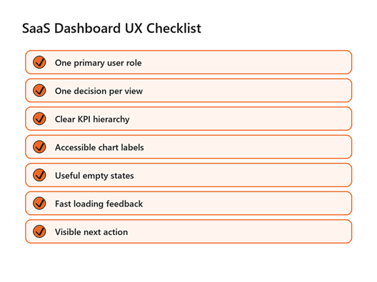
A compact checklist for reviewing SaaS dashboard UX before launch.
The final step is measurement. Track whether users return to the dashboard, use filters, click drill-downs, export data, or complete the action the dashboard is meant to support. Qualitative feedback matters too. Watch where people hesitate, which labels they question, and which numbers they copy into another tool. Those moments reveal whether your ui ux design best practices for saas dashboards are working in the product, not just in the design file.
For SaaS teams using AI summaries or predictive recommendations inside a dashboard, the same rule applies: explain the source, confidence, and recommended action. Our AI business automation team can help connect those recommendations to workflows instead of leaving users with a mysterious score.
FAQs
What should a SaaS dashboard show first?
Show the primary role's most important decision first. For many products, that means three to five KPI cards with trend, target, or comparison context. The first view should answer whether attention is needed before asking the user to filter, export, or investigate.
How many charts should a SaaS dashboard have?
There is no fixed number, but the first screen should stay focused. Use only the charts needed to explain the main decision. Put secondary analysis behind drill-downs, tabs, or saved views so the dashboard stays useful for quick repeat visits.
Are dark dashboards better for SaaS products?
Dark mode can work for monitoring tools, developer products, or environments where users spend long sessions. It is not automatically better. Test contrast, chart readability, and meeting-room visibility. Many B2B SaaS dashboards still perform best with a light default and optional dark mode.
How do you design dashboards for different user roles?
Start by mapping each role's job, decisions, permissions, and urgency. Then create default views for those roles instead of one universal page. Shared components can stay consistent, but KPI priority, filters, and next actions should match the user's responsibility.
What is the biggest SaaS dashboard UX mistake?
The biggest mistake is showing data because it exists. A dashboard should not be an inventory of metrics. It should be a decision surface with clear hierarchy, context, and action paths. If a metric does not support a decision, move it deeper or remove it.
External Links Referenced
Accessibility baseline: W3C WCAG 2.2
Data visualization guidance: U.S. Web Design System data visualizations
Dashboard and chart principles: Michelin Design System dashboard principles
Final Thoughts
Great SaaS dashboards are not built by adding more charts.
They are built by deciding which job the screen must support and then removing
anything that slows that job down. The mistake to avoid is treating the
dashboard as a data warehouse with nicer styling. If you would rather not build
this from scratch, our team at Optivanced does it every week through product-focused UI/UX design. Want a custom
plan for your business? Get a free quote and we will send you a
tailored proposal within one business day.