
A thumbnail is not just a tiny graphic. It is the promise your video makes before the title, intro, or first frame can do any work. This guide shares youtube thumbnail design tips for higher click through rate that help creators earn better clicks without misleading viewers. By the end, you will have a repeatable thumbnail system, mobile-first design rules, a testing workflow, and a checklist for YouTube Studio. At Optivanced, we treat thumbnails like campaign creative: they must grab attention, match the content, and protect viewer trust after the click.
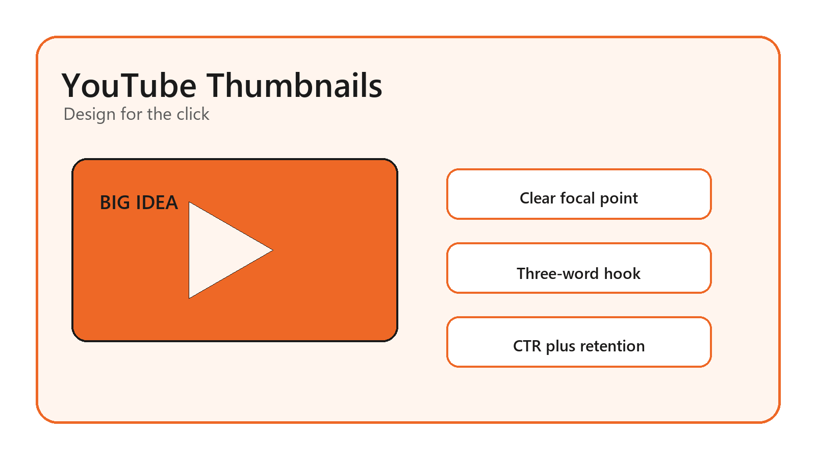
What Makes a YouTube Thumbnail Clickable?
A clickable thumbnail is not the loudest image in the feed. It is the clearest visual answer to a viewer's question. The viewer is usually deciding fast: is this for me, can I understand it, and does it look worth my time? The thumbnail and title should work together like one sentence, with the image carrying the visual proof and the title adding context.
The best youtube thumbnail design tips for higher click through rate start with that promise. A tutorial thumbnail might show the result. A review thumbnail might show the product and verdict tension. A reaction thumbnail might show the emotional moment. A business explainer might use a clean before-and-after, chart, or object metaphor instead of a forced face.
If your channel needs a consistent visual system, our YouTube thumbnail design service can build templates that keep each video recognizable without making every upload look like a clone.
Start With YouTube Specs and Mobile Reality
YouTube's official thumbnail help recommends custom thumbnails at 1280 x 720 pixels, with a minimum width of 640 pixels, JPG, GIF, or PNG format, under 2MB for videos, and a 16:9 aspect ratio. Those specs are not decoration. If the file is blurry, cropped strangely, or rejected by YouTube Studio, the design never gets a fair test.
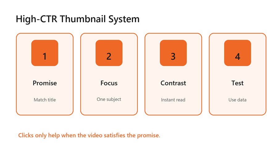
A high-CTR thumbnail system connects promise, focus,
contrast, and testing.
Design at the size where people actually see the thumbnail. On mobile, a detailed desktop mockup can collapse into noise. Check the image at small sizes before exporting: the focal point should still read, the text should still be legible, and the background should not compete with the main subject.
Also remember YouTube's note about Shorts: custom thumbnails are handled differently than long-form video thumbnails. If your growth plan includes Shorts, long-form videos, and community posts, our social media post design team can adapt the same visual idea across formats without breaking platform rules.
Design Around One Focal Point and One Hook
A high-performing thumbnail usually has one dominant visual subject. That subject might be a face, product, tool, result, mistake, screen detail, object, or number. When there are five focal points, the viewer has to solve the image before deciding whether to click. That delay costs attention.
Use text sparingly. Three words often work better than a sentence, and sometimes no text is stronger if the image and title already carry the story. The text should add tension or clarity, not repeat the full title. “BAD SETUP,” “BEFORE THIS,” or “$0 TO $10K” can work because they create a fast read.
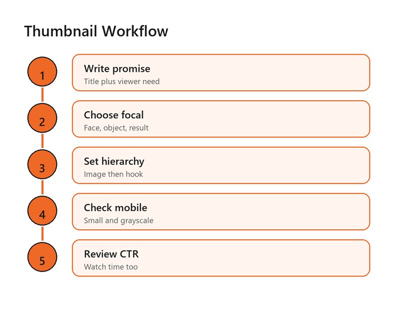
A repeatable workflow moves from promise to focal point,
hierarchy, mobile check, and analytics review.
Contrast matters more than color preference. Make the subject brighter or cleaner than the background. Use a shadow, outline, color block, or simple shape to separate text from the image. Avoid thin fonts, tiny labels, busy screenshots, and low-contrast colors that disappear in dark mode or on a phone screen.
Match the Thumbnail to the Title and Video Payoff
CTR is not a license to trick people. YouTube's impressions click-through rate FAQ defines the metric as how often viewers watched after seeing a registered impression, but it also notes that CTR varies by content, audience, and where the impression appeared. That means a high CTR on one traffic source is not automatically proof that the thumbnail is healthy.
The thumbnail should create curiosity that the video actually resolves. If the image promises a dramatic reveal and the video gives a slow generic explanation, viewers leave. That can damage watch time, satisfaction, comments, and future recommendations. Good thumbnails pull the right viewers in; bad clickbait pulls the wrong viewers out quickly.
A simple test is to write the thumbnail promise in one sentence. If the video does not deliver that sentence within a reasonable time, change the thumbnail, title, or opening structure. For business channels, our brand identity design specialists can help keep curiosity aligned with the brand instead of chasing random viral styles.
Use Faces, Objects, and Screenshots With Intent
Faces can work because people read expression quickly, but they are not mandatory. A face helps when the video depends on emotion, transformation, reaction, or personality. It can hurt when the expression feels fake, repetitive, or unrelated to the topic. In tutorial, software, ecommerce, finance, and B2B content, a clear object or outcome may outperform a forced face.
Screenshots need editing. Raw app screens are usually too dense, so crop to one decisive area, enlarge the important part, blur or simplify the rest, and add one visual cue. If the viewer needs to zoom to understand the screenshot, it is not thumbnail-ready.
Product and tool thumbnails need scale and context. Show the object big enough to identify, then add a visual result, warning, or comparison. For example, a creator reviewing a camera does not need five small camera angles; one camera plus a bold “WORTH IT?” hook may communicate faster.
Adapt the Formula to Your Video Type
A thumbnail formula should change by format. A tutorial needs the desired result, the tool, or the mistake being fixed. A comparison video needs visual contrast between option A and option B. A commentary video needs the central tension. A case study needs proof that something changed. A list video needs a strong category cue and one surprising item.
This is where generic youtube thumbnail design tips for higher click through rate often fall short. They tell every creator to use bright colors, huge faces, and short text. Those moves can work, but they are not a strategy. A finance explainer, cooking channel, SaaS tutorial, travel vlog, and gaming channel have different audience expectations. The design system should respect the niche before chasing a universal style.
For tutorials, show the finished state or the exact problem. For reviews, show the product and the verdict tension. For entertainment, show the emotional peak without spoiling everything. For B2B or educational content, use clean hierarchy, one visual metaphor, and a title pairing that makes the value obvious.
Creators should also build a small swipe file from their own channel, not just from large competitors. Save thumbnails that earned strong CTR and decent retention. Then label why they worked: face, object, contrast, text, topic, title, timing, or audience fit. Over a few months, that swipe file becomes more useful than broad advice because it reflects your audience.
Benefits of a Repeatable Thumbnail System
The best youtube thumbnail design tips for higher click through rate become more useful when they are systemized. A channel should not redesign its entire visual language every upload. Instead, build a small set of layouts for recurring video types: tutorial, review, comparison, list, case study, reaction, and mistake video.
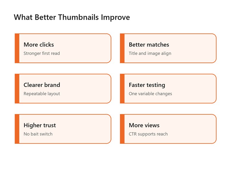
A better thumbnail system improves clicks, trust, brand
consistency, testing speed, and reach.
Templates speed up production and make testing cleaner. If one video changes everything at once, you cannot tell whether CTR improved because of the face, text, color, title, topic, or timing. When the template is stable, you can test one meaningful change: text position, focal crop, contrast, facial expression, object angle, or title pairing.
A repeatable system also helps thumbnails support other creative assets. Cover images, shorts frames, email banners, and ads can borrow the same visual hook. If you use AI-generated imagery or edited video stills, our AI creative content and video studio can help build cleaner creative variations while keeping the result on-brand.
Common Thumbnail Mistakes That Lower CTR
- Writing too much text inside the thumbnail.
- Using a busy screenshot without cropping or emphasis.
- Repeating the title instead of adding visual tension.
- Using the same face pose on every upload.
- Designing only on desktop without checking mobile size.
- Making the thumbnail more dramatic than the video payoff.
- Changing thumbnails without tracking traffic source and watch time.
The most common mistake is confusing attention with clarity. A thumbnail can be bright, noisy, and still unclear. If the viewer notices it but cannot understand the video promise, the design is not doing its job.
Another mistake is measuring CTR in isolation. YouTube's thumbnail and title tips recommend checking metrics in YouTube Analytics after posting, including performance by audience and traffic source. A homepage thumbnail, search thumbnail, and suggested-video thumbnail may behave differently because the viewer intent is different.
A Practical Thumbnail Testing Framework
Use a simple testing rhythm. Before upload, create two strong concepts rather than one final image and one weak backup. Check both at phone size, grayscale, and beside competitor thumbnails for the same topic. Ask whether the image is understandable without the title, then ask whether the title makes the image more compelling.
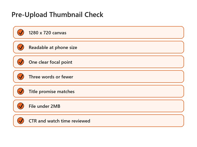
Use this checklist before uploading or changing a YouTube
thumbnail.
After upload, give the data enough context. Look at impressions, impressions click-through rate, average view duration, watch time, audience retention, and traffic source. A thumbnail that improves CTR but drops retention may be overselling. A thumbnail with lower CTR but stronger retention may be attracting fewer but better-matched viewers.
Give each test a clean note. Record the old thumbnail, new thumbnail, publish date, traffic source, title, and what changed. Without that record, a creator ends up guessing from memory and repeating the same unclear experiment. Small records make future creative decisions faster.
This is the practical heart of youtube thumbnail design tips for higher click through rate: improve the match between viewer intent and video promise. The best thumbnail is not the one that fools the most people. It is the one that helps the right people choose your video faster.
Use youtube thumbnail design tips for higher click through rate as a testing language, not a checklist you obey blindly. If your audience clicks minimalist thumbnails and watches deeply, keep that signal. If bright, face-heavy thumbnails raise clicks but reduce watch time, the channel is learning that attention and satisfaction are not the same metric.
Document the winner. Save the exported file, source file, traffic source notes, CTR range, title, topic, and what changed. Over time, your channel will build its own thumbnail playbook instead of copying generic advice from every niche.
FAQs
What is the best size for a YouTube thumbnail?
YouTube recommends 1280 x 720 pixels, a minimum width of 640 pixels, JPG, GIF, or PNG format, under 2MB for videos, and a 16:9 aspect ratio. Use those specs as the baseline before testing color, text, or layout.
How many words should a YouTube thumbnail have?
Use as few as possible. Three words or fewer is a strong practical rule for most channels because the thumbnail has to work on mobile. If the title already explains the topic, the thumbnail text should add tension, contrast, or outcome rather than repeat the title.
Do faces increase YouTube CTR?
Faces can increase attention when the expression is genuine and relevant to the video, especially in personality-driven niches. They are not required. Tutorials, product reviews, documentaries, and business videos can often win with strong objects, results, screenshots, or comparisons.
Should I change a thumbnail after publishing?
Yes, when the data shows a mismatch. Review impressions, CTR, traffic source, average view duration, and retention before changing it. If CTR is low but retention is strong, the thumbnail may need clarity. If CTR is high but retention drops, the thumbnail may be overpromising.
What is a good click-through rate on YouTube?
There is no universal good CTR. YouTube says impressions click-through rate varies by content, audience, and where the impression appears. Compare videos within your own channel, topic, and traffic source instead of chasing a generic benchmark.
External Links Referenced
Official thumbnail specs: YouTube Help: Add video thumbnails
CTR metric definition: YouTube Help: Impressions and click-through rate FAQ
Thumbnail and title analytics tips: YouTube Help: Thumbnail and title tips
Content performance reporting: YouTube Help: Understand your content performance
Final Thoughts
High-CTR thumbnails are built from clarity, not noise. A good thumbnail gives the right viewer a fast reason to click, then the video rewards that click with the promised payoff. The mistake to avoid is treating CTR like a trick instead of a trust signal. If you would rather not build this from scratch, our team at Optivanced does it every week through custom YouTube thumbnail design. Want a custom plan for your business? Get a free quote and we will send you a tailored proposal within one business day.